Showing posts with label abstract. Show all posts

Sunday, October 9, 2011

"The Drama of Objects"


 (I confess I am playing catch up with some of my posts!)
 
 
In August of 2011, I attended the Art Gallery of Ontario's exhibition "Abstract Expressionism" and while I knew there would be painting and sculpture to view, I was not prepared to see photography. I don't think one thinks of photography when they think of the Abstract Expressionism period.

Needless to say, I was stopped in my tracks when I came across the works of Aaron Siskind. (1903-1991) Siskind, like myself began his foray into photography at a later age. He was given a camera in 1930 as a wedding gift, and began taking photos on his honeymoon.

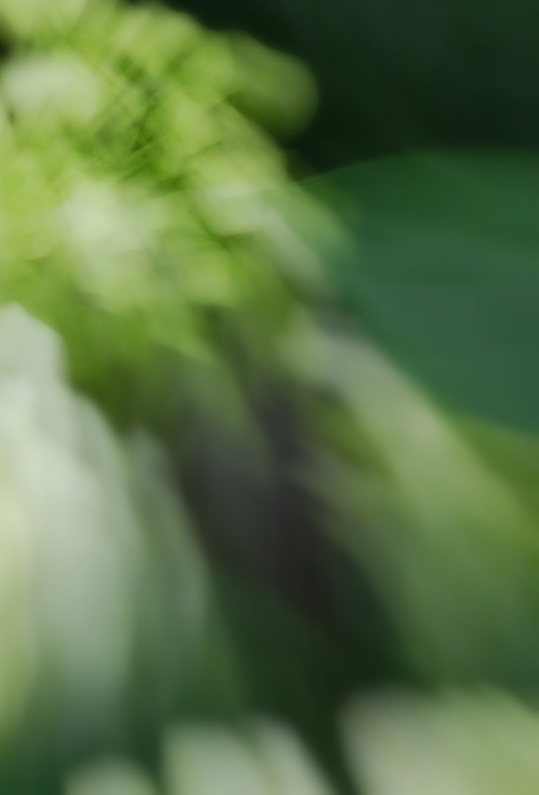
In the early 1940's he increasingly started creating abstract photos of forgotten and discarded items, facades, graffiti,and isolated figures. Like myself, he was drawn to the things that are abstract in our environment, lines, shapes and texture.

 
A major difference of course is that he was using black and white film, where as today I am using a digital camera. In his 1945 essay "The Drama of Objects" he asked the viewer when looking at his work to "Move on objects with your eye straight on, to the left, around to the right. Watch them grow large as you approach, group and regroup themselves as you shift your position. Relationships gradually emerge and sometimes assume themselves with finality. And that's your picture."

I was inspired to once again go back to my earliest group of photographs that were taken at a time when I had done little research or exposure to any of the 'greats' and was just learning the ins and outs of my camera. I then took it one step further, and keeping in mind his quote from the essay, removed all the colour from my images so that it is only the texture, lines, and patterns that you now see.

I was immediately taken back by how much the colour had played into my original emotional reading of the photograph, and now I have to re look, re think about these images taken from the streets of Toronto. At first glance, one might overlook them and write them off as boring. But if you do as Siskind asks and approach the images from different viewing points, you may find that the image becomes more layered in emotions.

Finally, I want to end these notes with another quote from the Abstract Expressionist painter Adolph Gottlier:

" I frequently hear the question "What do these pictures mean?" That is simply the wrong question. Visual images do not have to conform to either verbal thinking, or optical facts. A better question would be "Do these images convey any emotional truth?"
 
***The last three abstract photos are Siskands.***

Monday, June 20, 2011

Green with Envy..


I am sure you have noticed that in the last few posts I start my entry by showing you some paintings in the colour scheme I have chosen to write about. I will be the first to say I know little about art, or art history and what little I do know is because a majority of my friends have degrees and or careers in the art world. How lucky was I to end up in the retail industry? But I digress..

I think like many artists/photographers their work may be individual or unique but they draw their inspiration from other sources. I love colour, and history and so they both tend to be my sources of inspiration. I am drawn to 19th century art just as much as abstract. It's all about the emotions I connect to the piece. Nostalgia, excitement, melancholy, yearning, happiness....all feelings I get when I am attracted to a work of art.

Green is second only to blue in terms of the most picked 'favorite' colour of people when asked. And generally that is because it has a lot of positive attributes to it. It is considered to be a soothing, and relaxing colour that alleviates depression, nervousness and anxiety. (hmmmm. perhaps I need to paint!) It is a colour that creates a sense of renewal, self control, balance, and harmony. In terms of interior spaces, it is for these reasons that green is often used in bathrooms, and work places.

People who are drawn to the colour are said to be very understanding, self-controlled, adaptable, sympathetic, compassionate, generous, humble, romantic...and no surprise here, nature lovers.

At the moment I actually have vases in my apartment filled not with flowers, but florist greens. They add a touch of woodland freshness and work well with my charcoal walls, and other blue green furnishings and photographs I have hanging. I particularly love the look of an all white space whether rustic or contemporary, and then a large art piece with fresh greens.

It makes me green with envy....


Here are some of my favorite green photographs I have taken.

Monday, June 13, 2011

Feeling Blue..


Blue...

I once posted some photos I had taken on Facebook and had a friend reply I was in my 'blue period'. At the time I did not grasp the reference, but now know that she was referencing Picasso's Blue Period (1901-1904) Blue is one of my favorite colours, and with most things it is the deeper, darker blues that I am most drawn too. Cobalt, Indigo, Midnight blue. Blues that are inky, moody and rich.

I looked up some facts around the colour blue and in some cases I discovered some interesting tidbits. Blue is traditionally associated with depth and stability. It usually symbolizes trust, loyalty, wisdom, confidence, intelligence, faith, and truth. It is traditionally a masculine colour, but it is also associated with power, confidence and expertise. (Many business uniforms such as police, postal, the conservative government!!, tend to use blue for this reason.)

Blues are also known to be beneficial to the mind and body in that they instill a sense of calm, focus, and slow down human metabolism. (so if you need to lose a pound or two, paint your dining room blue!) People also tend to be more productive in a room with blue because of the calming and focusing qualities.

And of course, blue is also associated in many cultures with melancholy. Which of course since I think of myself as being full of melancholy at most times, it only makes sense I am attracted to blue. Now if I could only do something about getting more productive...


Here are some of my photos that have focused on the colour blue....

Wednesday, June 1, 2011

Seeing Red...


Red....the colour of love, passion, anger, and aggression. Did you know that at one time many fast food restaurants used the colour red in their interiors in order to create a passion and desire to eat more food. The funny thing is it also was used to hurry the diners up and get them out in order to have a greater turnover, thus more sales.

At home, especially in the 19th century, and early 2oth, red was often used in dining rooms. Red is a very flattering colour to most peoples skin tones, and combined with candlelight it made for a very cozy, flattering, and enjoyable evening. It was also used alot in drawing rooms, especially those with salon type walls chuck full of paintings, sketches, and photographs...Red seems to show off art work well. I believe there are even red walls in part of the exhibition spaces at the AGO here in Toronto.

Did I mention my kitchen is red? It is indeed. I always wanted a red room, and now I have one. I love it.

When I take a lot of my photos, especially when I focus on colour, pattern ,and texture, I always associate a feeling to the photograph. I also envision many of them hanging in people's rooms. Usually in large format, much like some huge painted canvas...I think colour is so important to each of us, and it often means different things to different people, hence the millions of colours available to us to purchase in the form of paint. There is an energy in colour, whether it is strong and vibrant, or soft and strong.. There is a colour pallet for each of us. Have you found yours? What is your favorite? How do you react to certain colours? It is such an interesting topic don't you think?

Enjoy your day, and I hope I have you seeing red..

Saturday, May 21, 2011

Urban Textures Revisited....

Last weekend while I was sorting and editing some of the floral abstracts I have been posting I had one of those a-ha! moments. It had suddenly dawned on me to go back and take a look at one of my earlier subjects and then re-interpret them with some of the new skills/techniques I have learned since then.

So out came the camera and the umbrella and I headed over to one of the more colourful spots in Toronto, Queen Street West. The first time around I had focused on Urban Textures as I was actually viewing them, and only used composition as my way of expressing how I was seeing them. This time, it was still about the colours and patterns, but less about fine details. I decided to experiment using the same techniques I have been using with the floral images, and my Kaleidoscape series.

The result is an explosion of colours, and some wonderful, (in my opinion) abstract shots. I can't wait for my next day off, and hope to build up the portfolio with a few more...


Here are a couple for you to take a look at..

Thursday, May 19, 2011

Fresh and green...

Anyone who lives in the Toronto area knows we have had our fair share of rain this spring. It seems we get 24 hours of rain, for every hour of sun. Everything is behind almost 3 weeks in terms of nature. My friends forsythia tree is just now dropping its bright yellow flowers that usually herald the start of spring. This also happens to be the first long weekend that 'unofficially' starts the beginning of summer. Here in Ontario it marks the beginning of planting season.....

This year however, the ground is wet, and it hasn't stopped raining long enough for most people to cut their grass, or turn the soil over never mind planting.

Can you tell, I also happen to love gardening? Granted I now live in an apartment building and my gardening is limited to what I can put on my 15 foot balcony. It is a good thing that one of my friends owns his own house and lets me putter away in his yard when I can. I just helped him put in an herb garden which I can't wait to reap the rewards. Now we just need some sunshine, to dry the ground out a little, and we will plant some veggies, and more flowers. Come on Mother Nature, put away those tears for a bit anyways...


In the meantime, here are two pictures I took in the greenhouses on Easter Sunday...Hope you enjoy them.

Sunday, May 15, 2011

Seeing Red..

If you have been reading my entries most of you know that I have not been able to get out and spend much time with my camera of late. I have found myself working 6 days a week between two jobs, and have been collaborating with a couple of friends on a production about photography for this summers Fringe Festival. Not that I am complaining, I can certainly use the money to move forward with photography, and the theater project has been extremely exciting for me. I can't wait to see the results of incorporating photography into an original play.

On Easter weekend, I did find a whole hour of spare time, and so grabbed my camera (which still needs to have the sensor cleaned!) and ran over to Allen Gardens to do some more abstract colour shots. It may have been a quick shoot, but I was happy with most of the results.

This is the first one I will share with you....Hope you like it!

Sunday, May 8, 2011

Retrospective Part 5 of 5...

Here it is. The last portfolio I entered into the contest. (Portfolio contest, "Color" magazine). So now it will be another month or two of waiting for the results. In the mean time my plans are to get the camera all cleaned, and serviced, and perhaps look at purchasing a new lens. I'm thinking wide angle....


Did I mention I am collaborating with a couple of friends on developing a play about photography for this years Fringe festival here in Toronto? (July) We have titled the play "Exposure" and we will be showing at the Tarrogon theatre...I will post the details, as they come. ;)